.png)


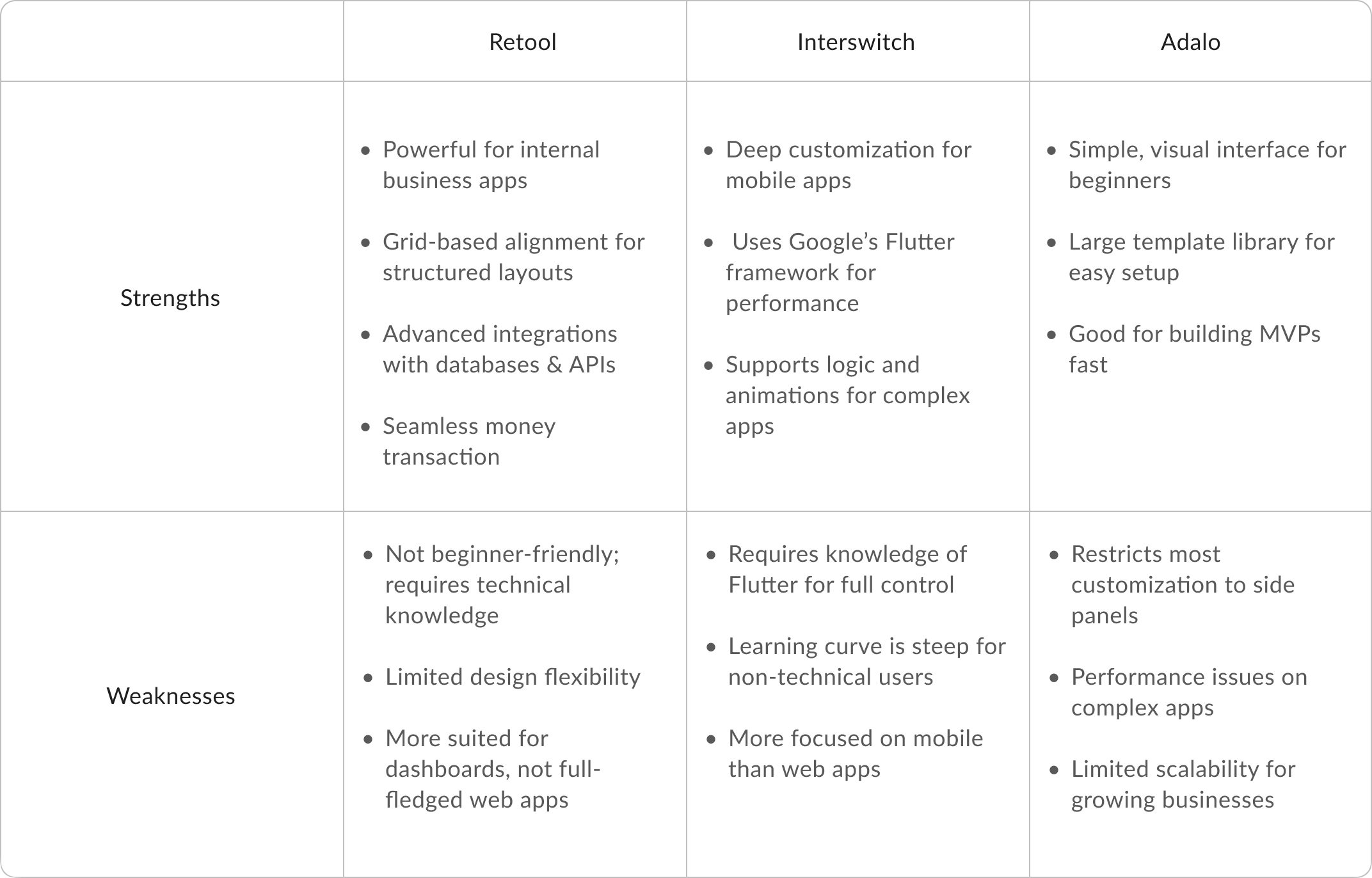
Researching Dexla’s competitors revealed key gaps in existing no-code platforms, shaping my approach to designing a more intuitive and accessible interface. Many competitors, like Retool and Flutterflow, required technical knowledge, while others, like Unstack and Adalo, restricted customisation to side panels.
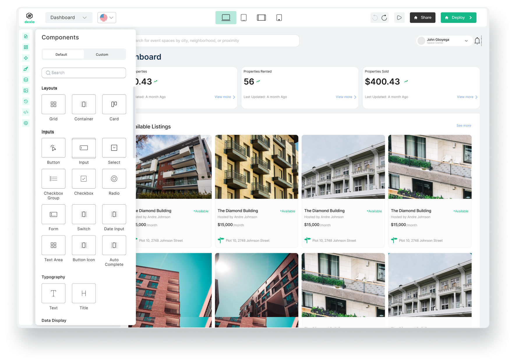
I saw an opportunity to simplify web app development by integrating direct canvas editing, AI-assisted onboarding, and a structured 96-column grid system, allowing users to build with precision while keeping the experience fluid and beginner-friendly.
A major takeaway from platforms like Webwave and Jetadmin was the importance of alignment tools and spacing indicators. Inspired by their use of cross-hairs, rulers, and snap-to-grid mechanics, I designed Dexla’s drag-and-drop system to offer clear visual feedback, reducing frustration when positioning components. Unlike tools that required separate panels for fine-tuning, I ensured users could adjust layout, spacing, and resizing directly on the canvas—enhancing both speed and usability.
This research-driven approach led to a faster, more intuitive Dexla experience that empowers non-technical users to build apps effortlessly. By eliminating common pain points, complex terminology, rigid drag-and-drop mechanics, and hidden customisation settings, I crafted an interface that prioritises clarity, flexibility, and efficiency.
The result? A platform that helps entrepreneurs focus on their ideas rather than the technicalities of app building.
We solved the terminology simplification by consulting with stakeholders and developers to agree on certain terms.
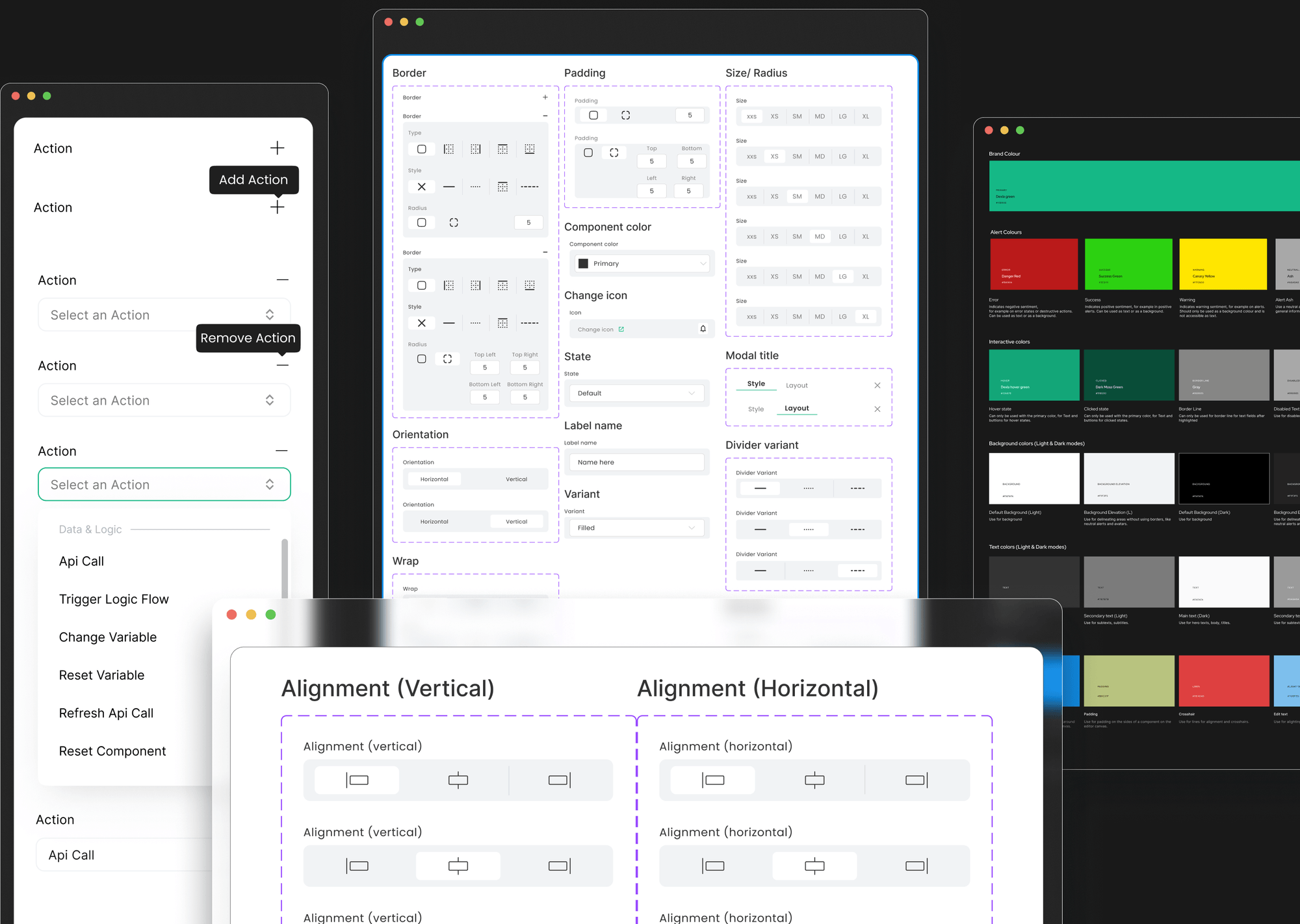
I led the creation of a well-structured design system. This served as a foundation that fostered collaboration and reduced inconsistencies. Before diving into redesigning, we were torn between using either Grid or Flex to simplify positioning components onto the canvas through the drag-and-drop process.
While each approach had its advantages and drawbacks, we had to choose the solution that would best meet our target audience's needs. The team couldn't decide on either approach.
Therefore, we decided to compare both approaches by implementing each one separately. Below, I will walk you through our thought process for each solution.
We thought maybe a simplified version of Flexbox could work. I knew the ins and outs of flex layouts, so I figured I could hide the complexity and make it user-friendly.
I designed:
It worked… sort of. It looked great, but testing showed that performance started to dip with too many flex containers. And from a dev perspective, it would have taken months longer to go live. Not worth it. So we moved on.

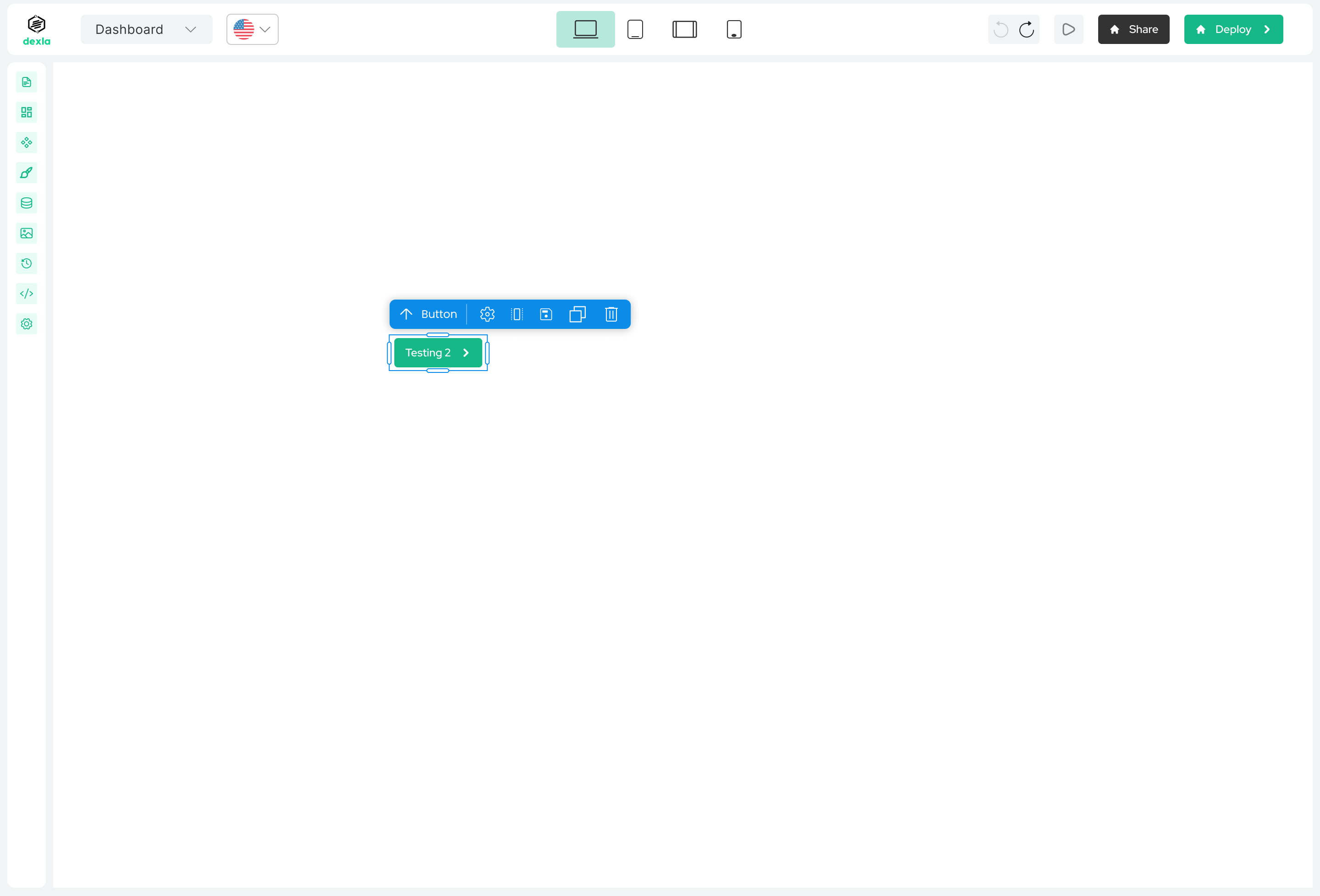

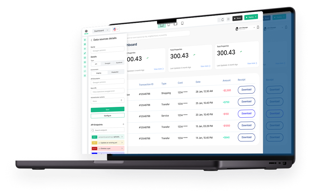
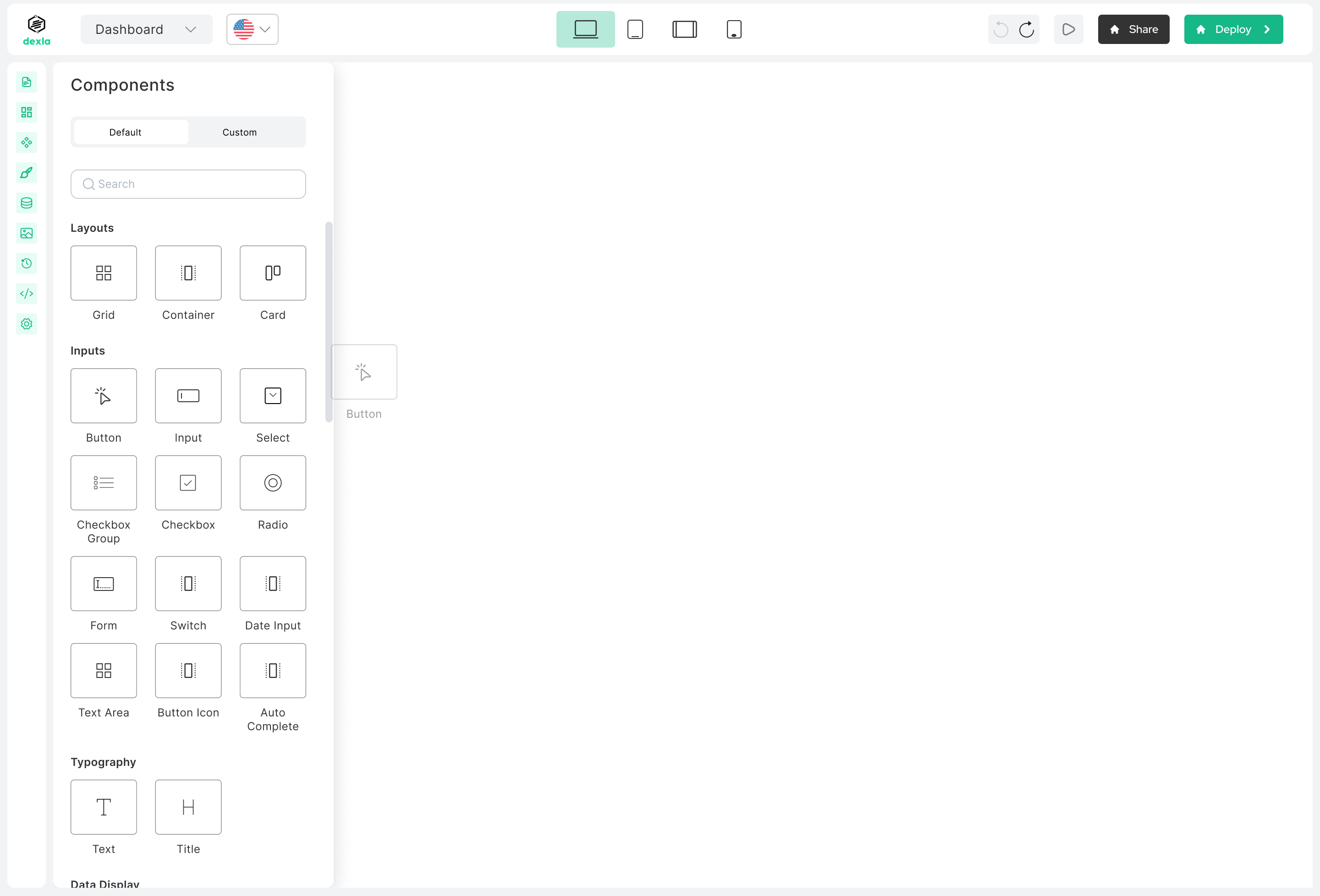
This approach used a 96-column layout behind the scenes. Components would snap into place on the canvas, stretch across columns, and scale responsively. We added:
It worked. Really well. We tested it by building a full web page from scratch, and it took less than 15 minutes. And the experience felt simple, visual, and fast. Way more suited to our audience.
Business owners could now focus on their ideas, not on fiddling with weird layout settings or wondering what "flex-direction" meant. The final version of Dexla was:

This project reminded me that simplicity is really hard to design for, but so worth it. This project taught me the importance of:
Oh, and I also designed and built Dexla’s marketing site in Webflow. You can check that out here