Streamlining Cross-Border Transfers

UX research
UI design
2023

Overview

This project began with a simple frustration we’ve all probably had at some point:"Why is sending money across countries still so complicated?"

We saw an opportunity to design a platform that felt simple, transparent, and trustworthy, especially for users in Nigeria who deal with international transactions regularly, whether for family, business, or freelance work.

With FlexPay, we set out to design a cross-border payment platform that does more than send and receive money. It empowers users to save, swap currencies, use virtual cards, and avoid all the hidden stress that usually comes with financial apps.

Competitor Analysis

What exactly are users struggling with?

Before diving into design, we wanted to understand what’s already out there and where it falls short.

We analysed leading platforms like Paga, Interswich, and Remitly. Here's what we learned:
  • Most had complex onboarding with long forms and too many steps
  • International countries' coverage was limited or inconsistent
  • The lack of a currency swap feature in many existing platforms
  • The absence of built-in savings features for users who want to plan ahead
These gaps gave us direction. FlexPay needed to feel simple, transparent, and flexible from the first screen to the final confirmation.

Talking to Users: Survey + Interviews

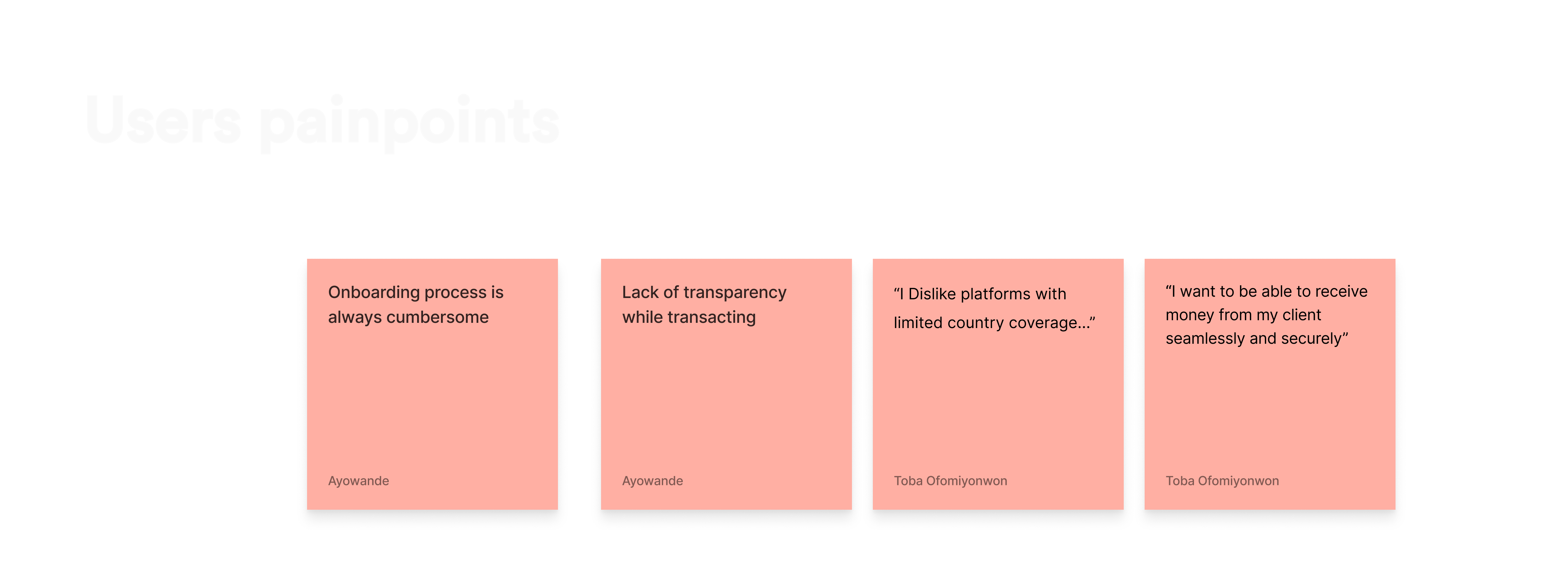
To dig deeper, I created a 10-question survey and sent it out to potential users. We got 30 responses and conducted 5 one-on-one interviews. The survey asked things like:

Survey Questions

  • Hello, what is your name?
  • Nice to meet you. What’s your age bracket?
  • How often do you send or receive money internationally?
  • Have you used any payment systems or applications for international money transfers?
  • If yes, specify which one(s). Do you have any challenges when sending or receiving money across borders?
  • If yes, please let us know. What do you like about the present payment gateway you use?
  • What factors are most important to you when choosing a payment system for international transfers? Options were speed, transaction rate, security, convenience, and others.
  • When conducting a transaction, which payment method would you prefer? (Options were ‘the fee added to the transaction total’ and ‘the fee deducted from the amount being transacted.’)
  • Are you willing to pay extra fees for a faster transaction while sending money?
  • Do you prefer a web-based or a mobile app platform to perform your transactions?

What exactly were users struggling with?

Here’s what came up again and again:
  • Onboarding processes were long, manual, and often frustrating
  • Lack of transparency around fees or delivery time
  • Many platforms had limited country coverage
  • Users had trouble receiving money seamlessly and without delays
  • Customer support was either poor or completely unavailable

Ideation & Brainstorming

After understanding the users’ pain points from research, we engaged in a creative and collaborative process to generate a range of potential solutions for the project and also redefine the goals.

We started in FigJam, mapping flows and gathering all the ideas that came out of research. From there, I built low- and mid-fidelity prototypes in Figma, making sure each interaction felt purposeful.

We priotised designs that provides :
  • Making it easy to sign up and verify identity
  • Giving users transparency and control at every step
  • Including smart tools like virtual cards and currency swaps
  • Designing a clean, intuitive interface that’s accessible from day one

High Fidelity Designs

In this phase, I transformed the ideas generated during the ideation phase into visually appealing solutions. This is where I focused on creating user-centred designs that address user needs and improve usability.

Onboarding Screen

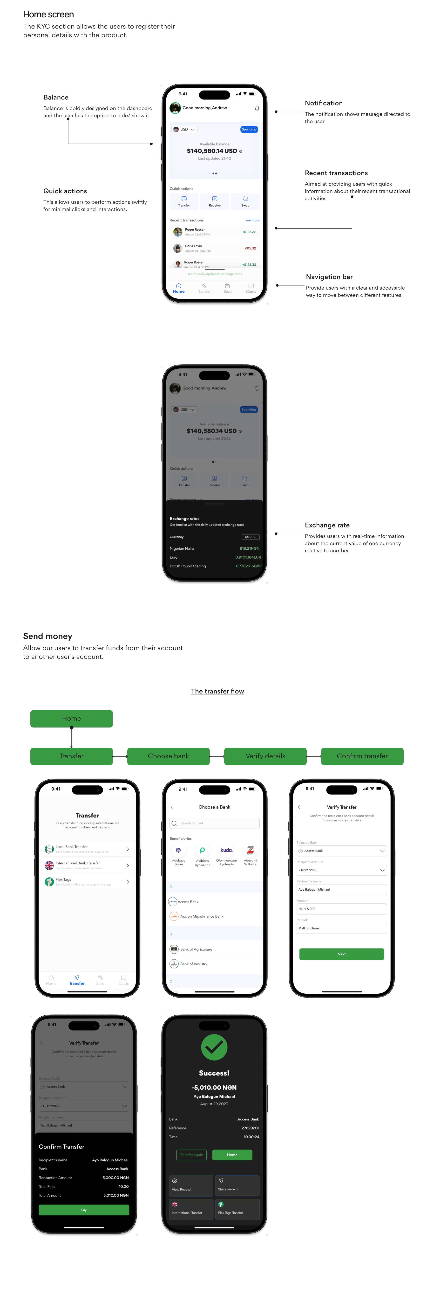
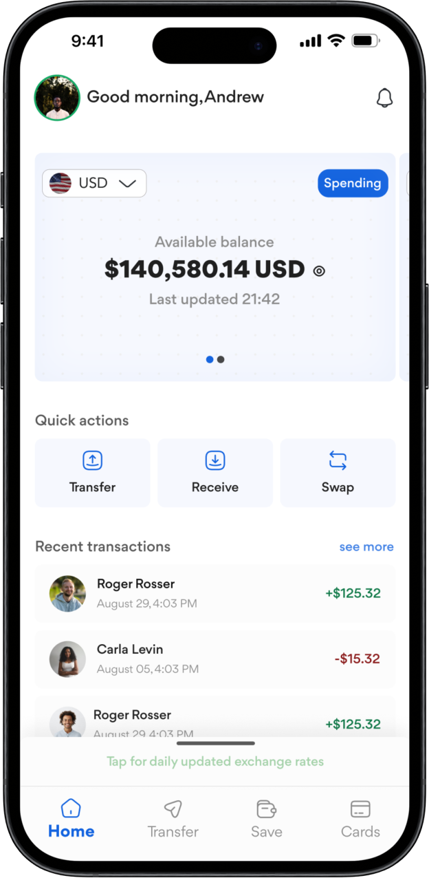
The onboarding screen gives a sense of welcome to our
users and serve as a mini intro to the product features.

Login & KYC Screen

Unlike the traditional method of the KYC/ Onboarding process, we opted for the use of ID verification numbers, which will automatically register the user’s information to the product without the user having to type in their details manually.

Virtual Cards

Users can create digital cards for online purchases or subscriptions. It gives them more flexibility and control, especially when managing multiple currencies or accounts.

Swap

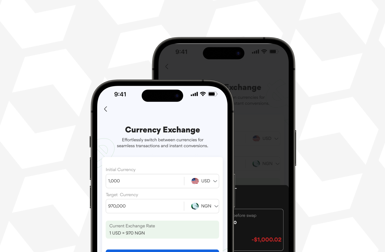
This feature allows users to swap currencies directly within their account. We kept it visual and simple, just select, enter an amount, and preview the conversion.

Key Takeaways

Working on this project with my amazing team members has let me know that the power of collaboration can’t be overstated.  Also, putting our users first was our guiding star. Every design decision, every iteration was anchored in enhancing the user experience. Their needs, pain points, and aspirations steered our ship.

Furthermore, in the fintech realm, finding the sweet spot between robust security measures and a user-friendly interface is an art. Striking that balance became a design challenge we welcomed with open arms.

Lastly, designing for tomorrow, not just today. Anticipating trends, embracing emerging technologies, and future-proofing our solutions were pivotal to creating a fintech platform that stands the test of time.

More projects