UX research
UI design
2025

Givn

A community application for sustainable reuse
through reuse and donations.
View outcome
People often hold onto items they no longer need until clutter becomes uncomfortable, leading many usable items to be thrown away. This contributes to growing landfill waste and increased carbon emissions. Givn was created in response to this problem as a community-based platform that encourages local donation and reuse.

The project grew out of earlier work on Ryderr, which focused on social impact through affordability but ultimately addressed a business challenge rather than a design-led one. This shift led to Givn, a solution aligned with SDG 12, aiming to reduce waste, promote reuse, and strengthen community-driven sustainability.
DOCUMENTATION 1 OF 6

Background

Ryder reduced inequality by making transport access more affordable for both low- and high-income users through prepaid plans.
In accordance with SDG 12, Givn focuses on reducing waste through donation and reuse.
To understand the problem Givn addresses, I explored both the scale of global waste and the behaviours driving it. Research shows that over two billion tonnes of waste are generated globally each year globally, closely linked to human development (Statista, n.d.).

To complement this, I conducted a user survey to understand everyday disposal habits. Insights from the Organisation for Economic Co-operation and Development (OECD) revealed that while people are aware of sustainable behaviours, they only adopt them when they are convenient, affordable, and accessible.

This was reflected in my survey, where most participants aged 19–45+ showed strong interest in reuse. As ideas began to feel broad and overwhelming, I narrowed my focus to key user types and their pain points. Through empathy mapping and journey mapping, I gained clarity on user expectations and frustrations. I then reviewed existing platforms and identified clear gaps, particularly in areas such as impact transparency, community engagement, and motivation. These insights shaped Givn’s direction, positioning it as a rewarding, impact-driven alternative to traditional marketplaces.
DOCUMENTATION 2 OF 6

Research

Human development continues, but Givn focuses on breaking the landfill cycle through reuse and donation.
The OECD finding aligns with my survey results, where 55.6% of participants do not use reuse platforms, highlighting accessibility and convenience as key barriers that informed Givn’s simplified reuse flow.
Shows that users choose the most convenient option, such as giving items to friends or family (77.8%). For items that could not be passed on to close contacts, 55.6% of respondents stated that they usually bin them.
Figure 1.2.4 shows that 66.7% of participants strongly preferred gamified sustainable behaviours. This insight aligns with Jo Tyndall’s emphasis on incentives. This justified including rewards and points in my design.
Shows that most participants were young adults. This influenced my design decisions around usability.
Figure 1.2.6 shows that most participants rated Givn as very valuable idea to the community.
This empathy map shows that users want to act sustainably, but often choose the easiest option instead. It clearly exposes a gap between what users feel and what they actually do, showing why simpler, more convenient, impact transparent solutions are needed to support better behaviour.
Shows a detailed journey map
Shows acomparison between major competitors. It also suggests that although reuse is possible, but what limits consistent participation is lackof motivation. With Givn, I was able to leverage this gap by being transparent with each donation and reuse, while gamifying the process.
I explored three core functions: swapping, requesting, and donating items. While these ideas were useful, I decided to focus only on donations to reduce complexity and cognitive overload. This helped create a clearer mental model and simpler user flows that better support the SDG goal of reducing waste. This decision influenced several early UI sketches.

This shift also led to a simpler navigation bar with four main tabs, including Activity. The Activity tab supports the in-person pickup flow by tracking walking distance and showing users the environmental impact of their actions.
DOCUMENTATION 3 OF 6

Workshop

Explores an early working title and logo for the project. At this stage, I did not realise they were too generic.
Figure 1.3.2 explores swipe gestures. These were removed to align with Jakob’s Law and match common two-column marketplace browsing layout.
Explores making environmental impact visible through real-time walking and pickup tracking to encourage sustainable behaviour.
Shows multiple core functionalities. Once I decided to focus on simplicity, I removed the urgent requests and quick actions sections.
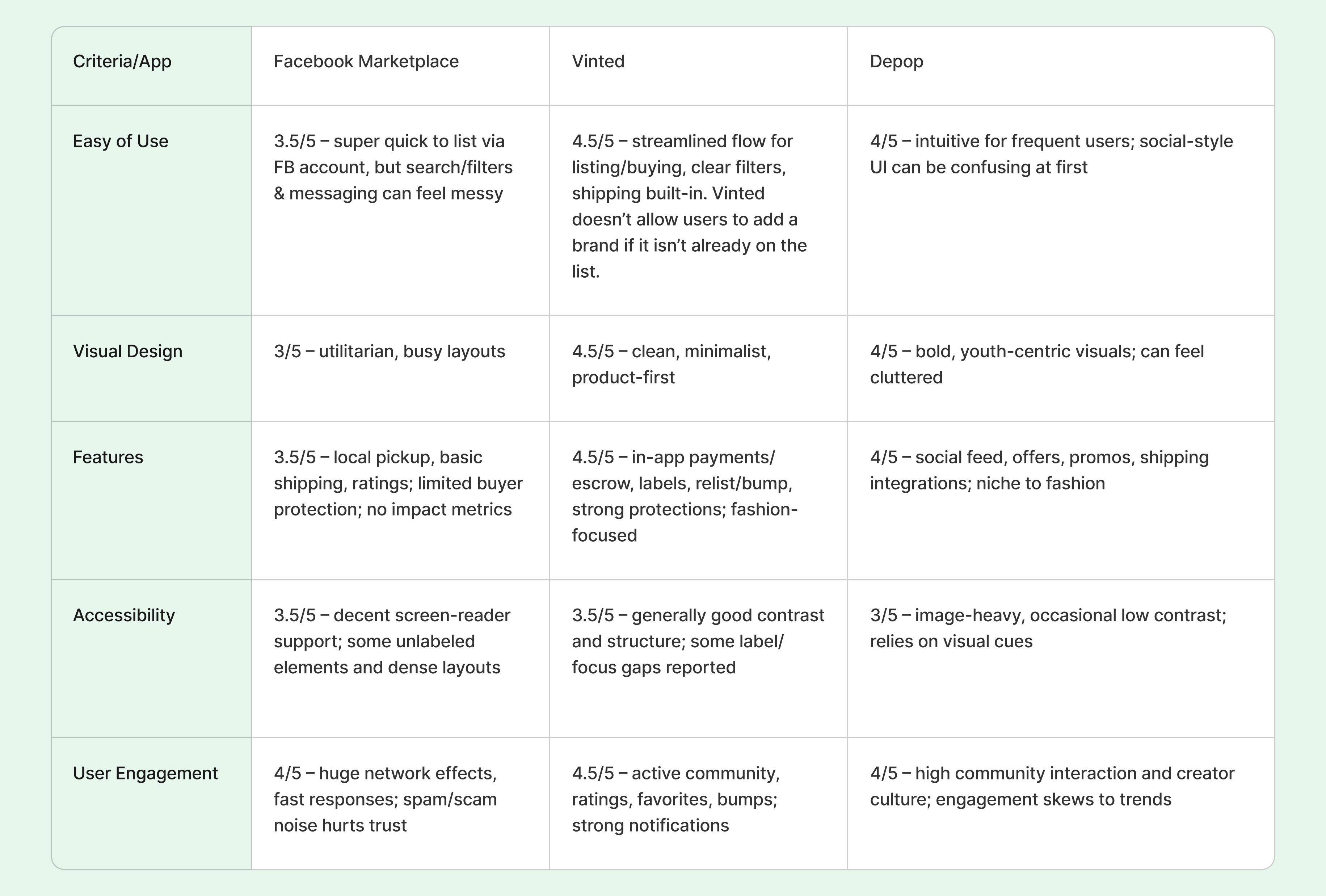
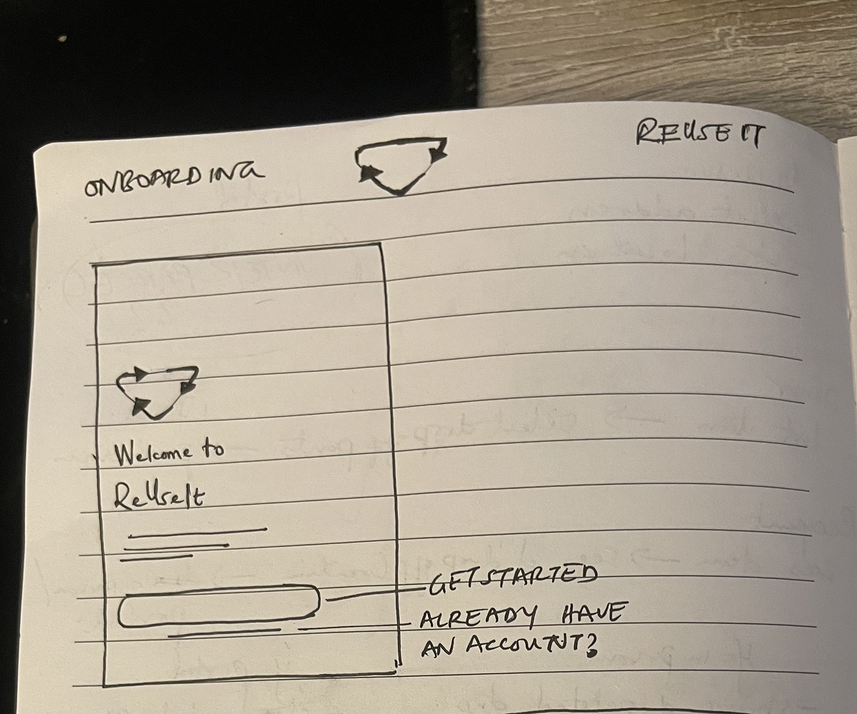
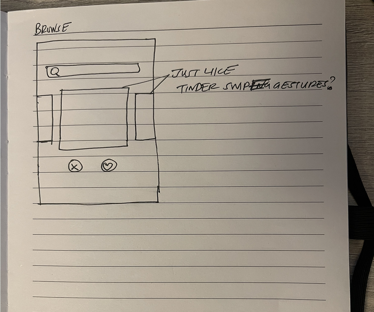
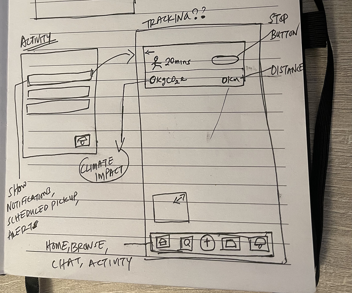
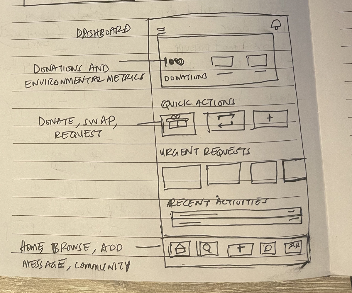
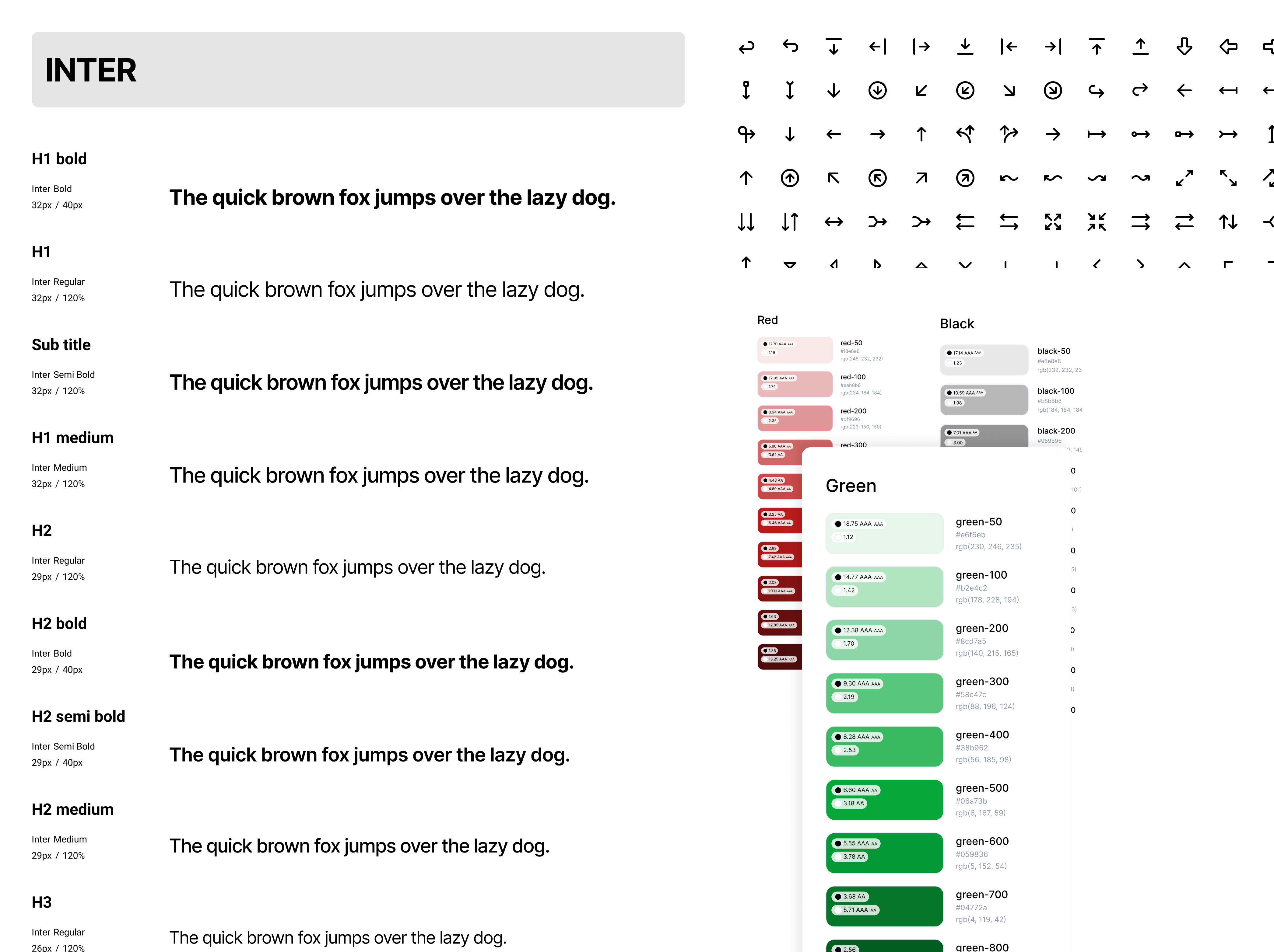
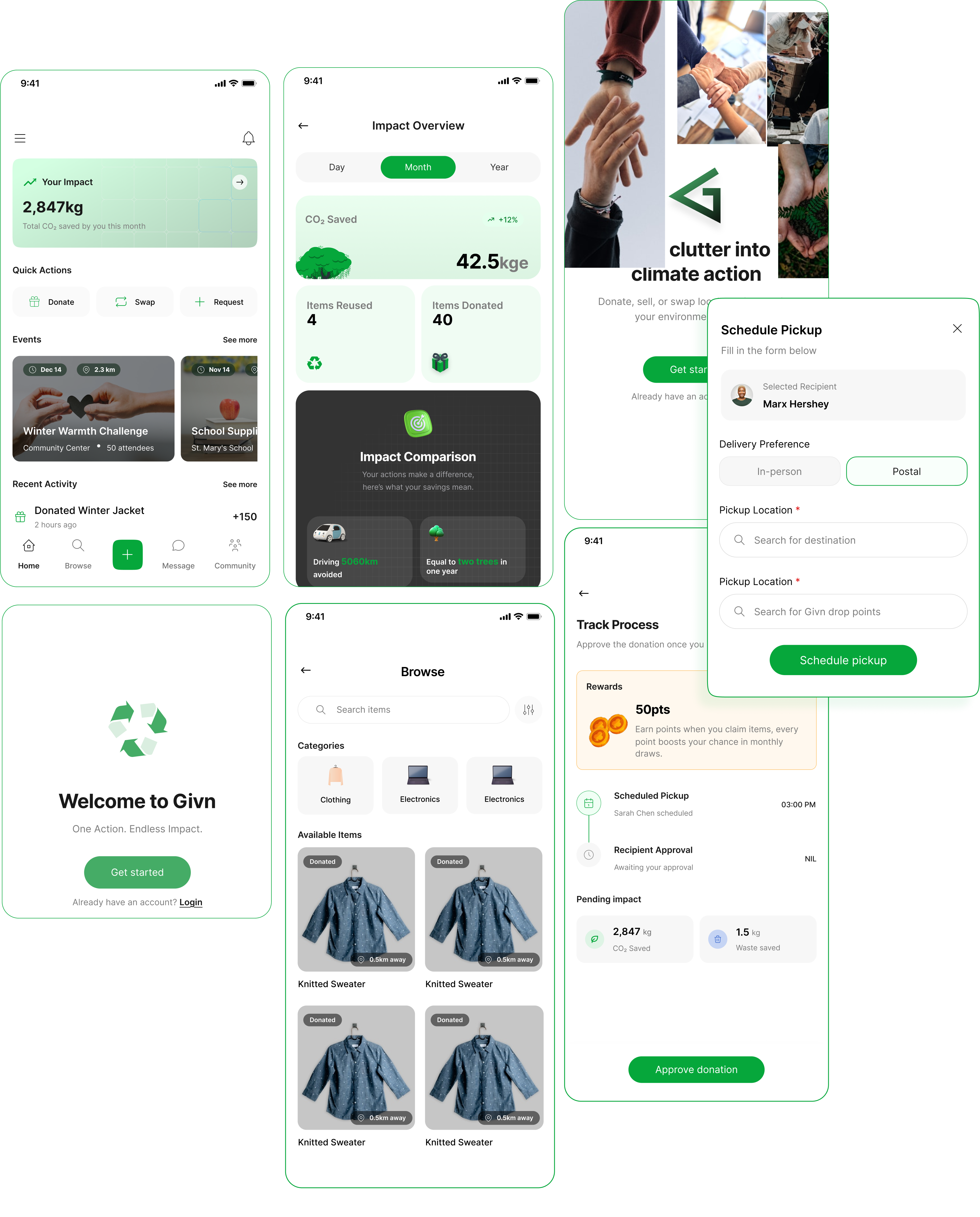
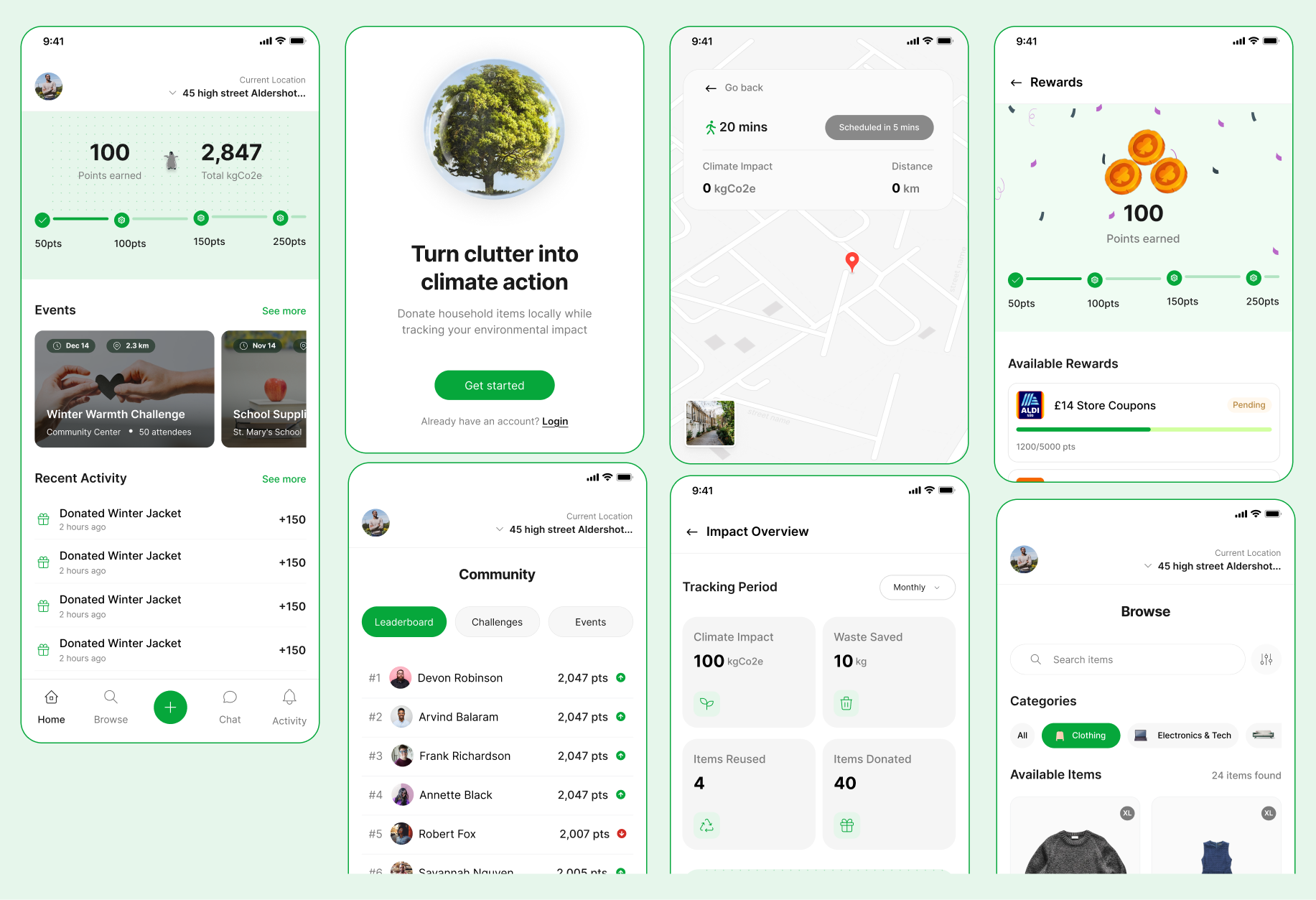
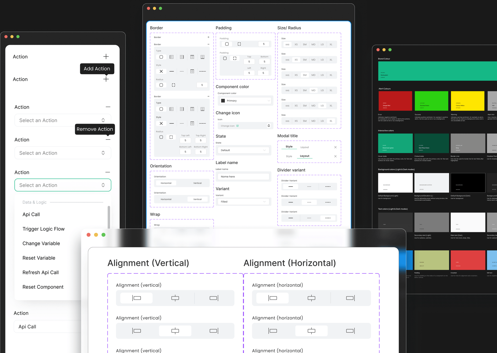
At this stage, I had a clearer direction and began creating low-fidelity designs for key screens such as the dashboard, browse, item details, and impact overview. To maintain consistency, I introduced reusable components and layout variants, which later evolved into a design system. Defining typography, colours, and button styles early helped speed up iteration and reduce visual inconsistencies.

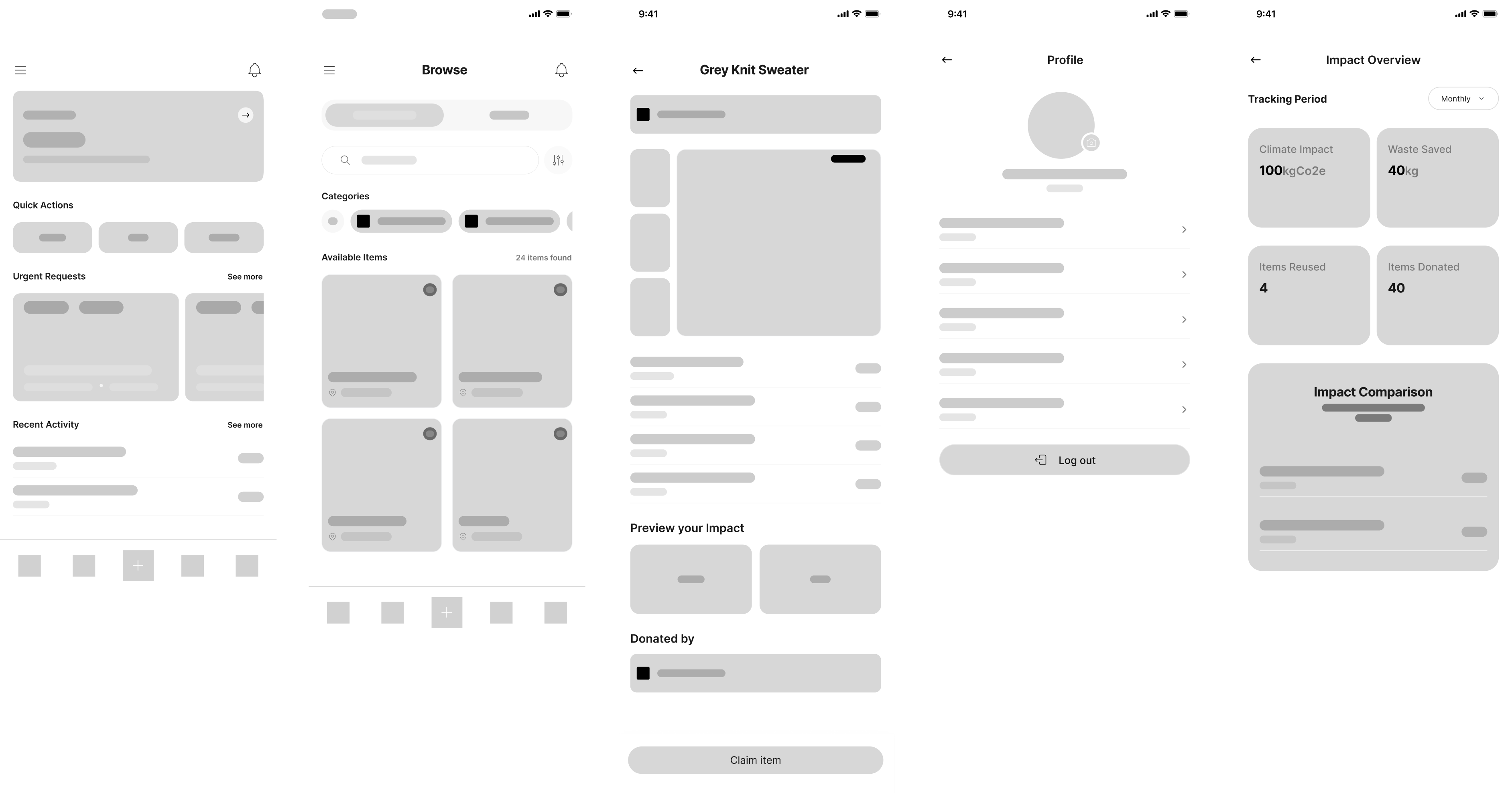
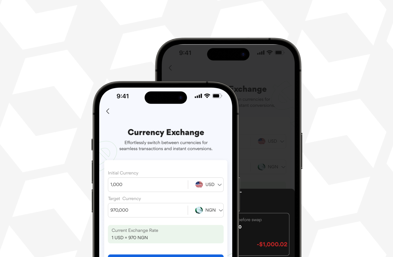
The project was renamed from ReUseIt to Givn to create a simpler and more memorable identity. I then moved into high-fidelity designs, iterating based on research insights, usability considerations, and feedback.

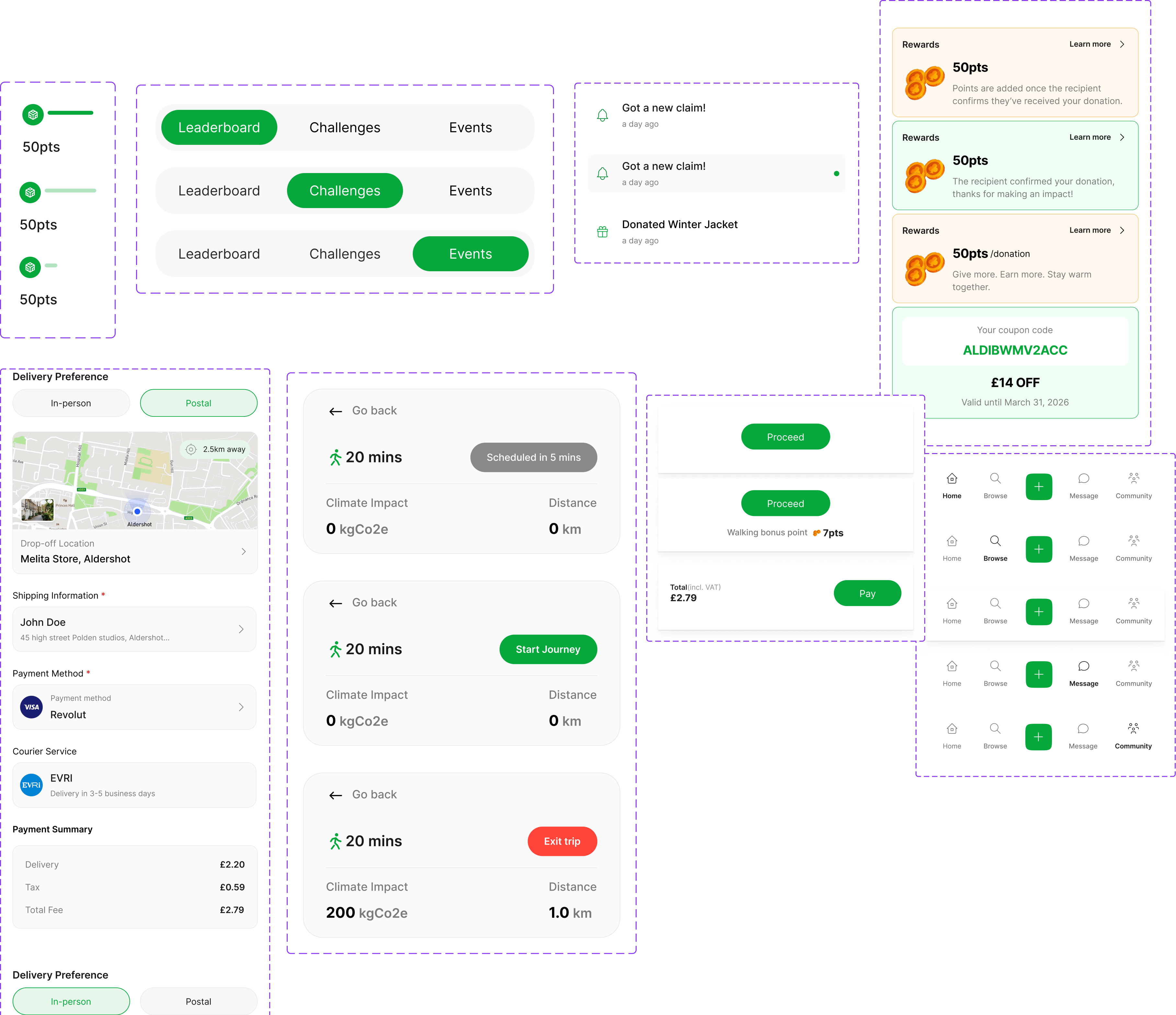
Many designs changed significantly from early sketches, revealing unnecessary complexity. Presenting these iterations highlighted key improvements, including simplifying pickup tracking, refining the dashboard, improving impact visibility, and increasing text size for accessibility, helping shape a clearer and more usable final experience.
DOCUMENTATION 4 OF 6

Experimentation

Shows low-fidelity wireframes. I used it to experiment with layout and flows for how users browse, view
Shows refined components and variants which made iterations easier across all created screens.
This design system supported faster iteration, visual consistency, and clearer usability decisions across all high-fidelity screens.
The Altron “A” typeface provided a strong geometric base but needed refinement to read as a “G.”
This led to experimentation by rotating the letter 90° to the left, revealing a new form of shape.
Tracing the letter on figma helping the logo read as a “G” while retaining a minimal and abstract feel.
The use of green gradient reinforces the sustainability theme of the project.
Shows high-fidelity iterations that revealed complex and unfeasible flows during prototype testing, leading to further refinements and iterations.
Shows images during presentation. The feedback from the presentation revealed usability gaps and helped refine flows and improve readability.
The innovation in Givn lies in turning everyday donation into a visible, rewarding action. Rather than functioning as a traditional marketplace, Givn focuses on making environmental impact transparent through real-time metrics, walking-based pickup tracking, points and rewards progression.

By combining impact tracking, local community engagement, and gentle gamification, Givn encourages users to build sustainable habits without added effort. This approach reframes reuse as a positive, trackable action, making climate-conscious behaviour feel achievable, personal, and motivating.
DOCUMENTATION 5 OF 6

Innovation

Highlights refined screens after iteration, showing clearer flows, reduced complexity, and stronger alignment with core goals.
The outcomes of Givn bring together research, iteration, and refinement into a clear, usable solution. The app successfully translates everyday donations into a structured flow that highlights impact, rewards, and community involvement.

Through multiple design iterations, the interface evolved to prioritise clarity, reduce cognitive load, and provide visible environmental value.

Together, these outcomes show how Givn moves beyond a traditional online markeplace platform by making sustainable behaviour visible, rewarding, and easy to maintain over time.
DOCUMENTATION 6 OF 6

Outcome

Walkthrough video

More projects

Wise-Young Explorer

View project

Dexla Design System

View project

Dexla Case Study

View project

Wise-Young Explorer

View project

Dexla Design System

View project

Dexla Case Study

View project

A product designer crafting thoughtful experiences  for modern software teams.

Hi, I’m Toba. I have spent the last 3 years helping startups design and build better products. Here’s some of my work.
View projects

UX Designer &

No-code Developer.

creating digital designs that people enjoy using and remember.
ABOUT ME
I can solve a Rubik's cube in 1:15, but that's just one way I keep my hands busy. When I'm off work, I sketch portraits with charcoal on alabaster paper, and recently dove into canvas painting.

My path to UI/UX design started with a mathematical mix-up – I thought it was related to dy/dx calculus. That confusion led to a two-year journey of crafting digital spaces people love to use
Read more
I can solve a Rubik's cube in 1:15, but that's just one way I keep my hands busy. When I'm off work, I sketch portraits with charcoal on alabaster paper, and recently dove into canvas painting.

My path to UI/UX design started with a mathematical mix-up – I thought it was related to dy/dx calculus. That confusion led to a two-year journey of crafting digital spaces people love to use
SELECTED PROJECTS
Infragen
Infragen is an AI platform that transforms raw data into powerful AI applications
Dexla
Dexla is a no-code AI app builder for non-technical business owners creating web apps.
FlexPay
FlexPay, a mobile app blending tech and finance for smarter money management.
Get Ryder app
SELECTED PROJECTS
Dexla Design System
A case study on Dexla's design system component library
Dexla Case Study
An AI app builder that allows business owners to build dynamic apps from an idea...
FlexPay
A mobile app blending tech and finance for smarter money management
Airstride
The product uses AI to help businesses build and manage distribution partnerships more efficiently.
REVIEWS

Take their words for it.

"I am delighted to provide a recommendation for Toba, with whom I had the privilege of collaborating closely during his tenure at letsremotify. Throughout this period, I had the chance to observe his extraordinary talents and unwavering commitment.  Toba is an exceptional UI/UX professional, possessing remarkable problem-solving abilities, leadership skills, and technical expertise. He consistently exhibited a deep understanding of the remote work environment."

Ali Ashfaq

Senior UX/UI designer

"I had the pleasure of working alongside Toba during our tenure at Zummit Africa. Toba is an innovative designer, consistently introducing fresh ideas to our projects. His dedication to learning and exceptional listening skills set him apart, and he consistently pushed boundaries to ensure the best possible outcomes. I wholeheartedly recommend Toba for any endeavor he takes on"

Victor Emokpare

Product designer

Great to work with and very quick to implement changes at any time. Top mentality and a great fit for any company.

Onyeka Kingsley

No code developer

"I am pleased to write a recommendation for Toba, whom I had the pleasure of working closely with at letsremotify. , I had the opportunity to witness his exceptional skills and dedication firsthand.  Toba is an outstanding UI/UX with a remarkable ability to problem-solving, leadership, technical proficiency. He consistently demonstrated a keen understanding of the remote work landscape.perience with your product/service"

Mehria Akhtar

Senior growth executive

"Working with Toba at Dexla Inc was a pleasure. As a Product Designer and No-Code Developer, he brought a rare balance of creativity and practicality to every project. His designs weren’t just visually polished—they were thoughtful, prioritizing user needs while staying aligned with technical constraints.

Toba’s no-code expertise streamlined workflows for our team, and his willingness to bridge design and development made him a trusted partner for engineers and PMs alike. If you value designers who care as much about functionality as aesthetics, Toba is a perfect fit."

Williams Balogun

Full stack engineer