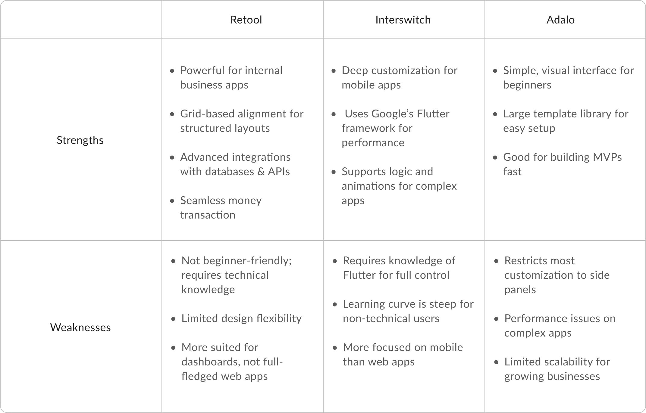
Researching Dexla’s competitors revealed key gaps in existing no-code platforms, shaping my approach to designing a more intuitive and accessible interface. Many competitors, like Retool and Flutterflow, required technical knowledge, while others, like Unstack and Adalo, restricted customisation to side panels.
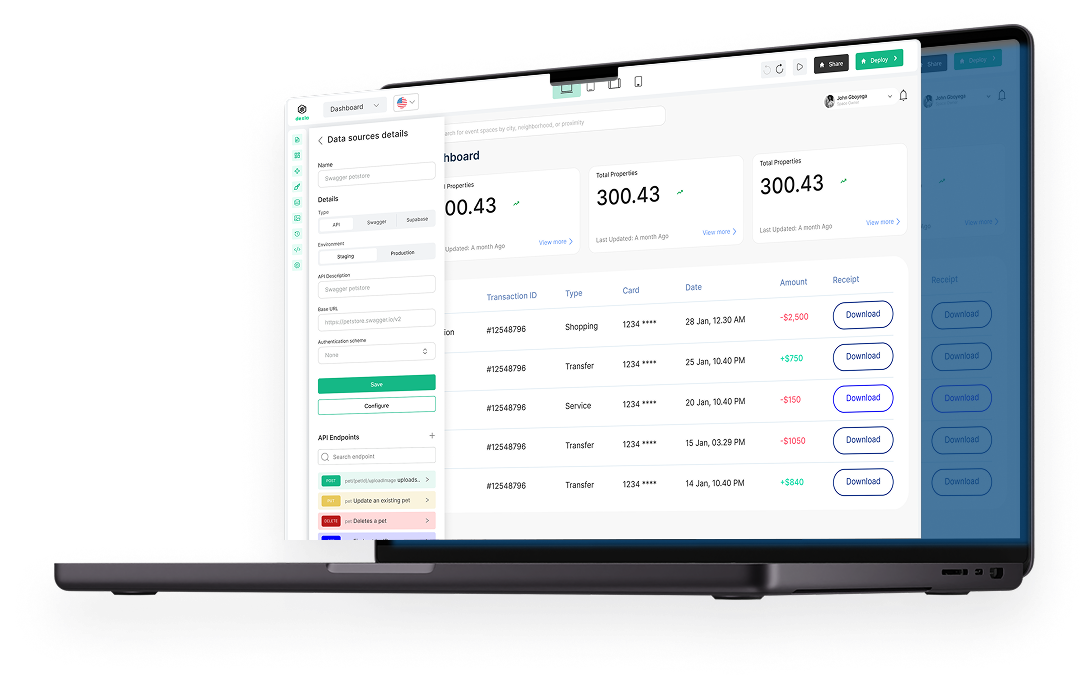
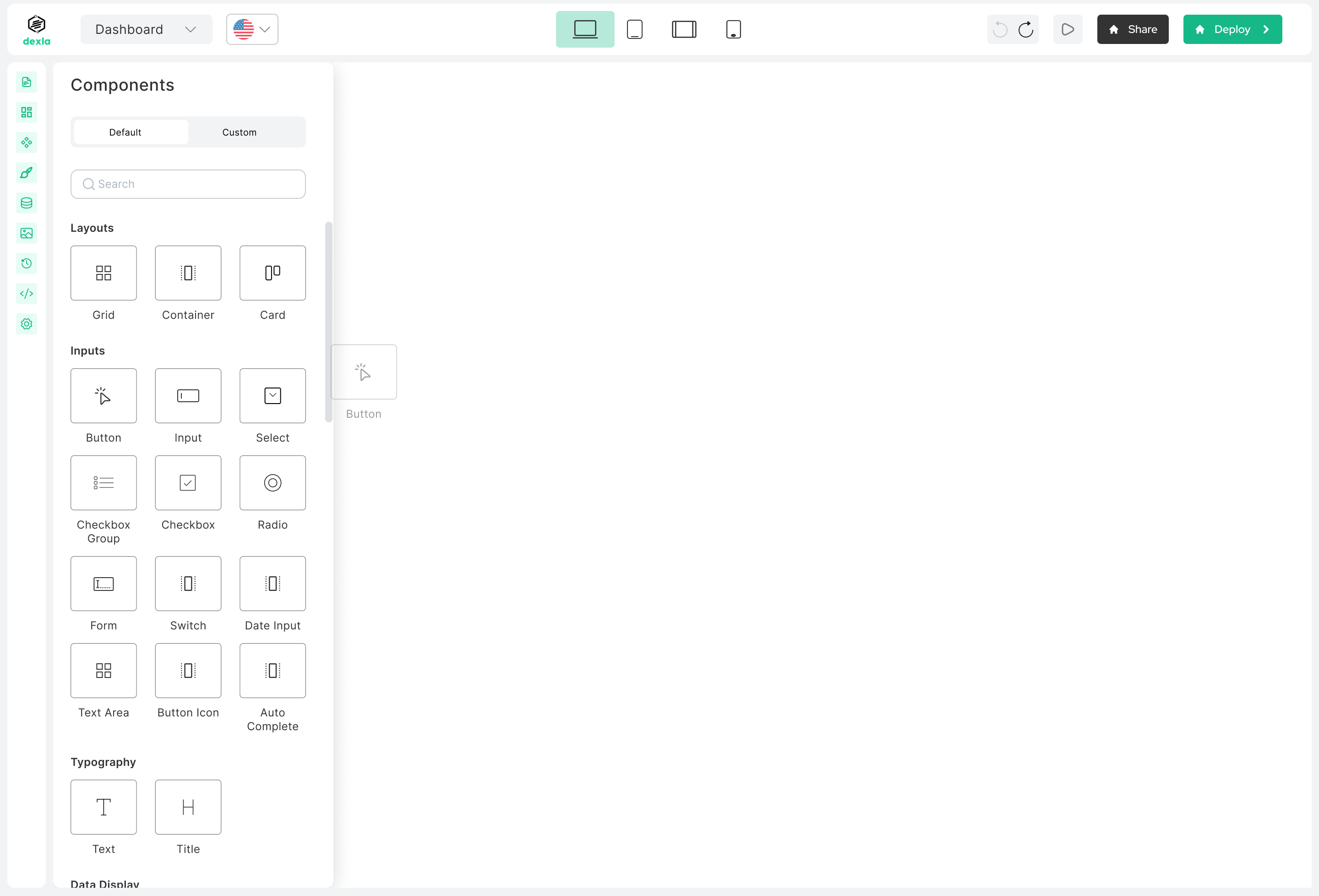
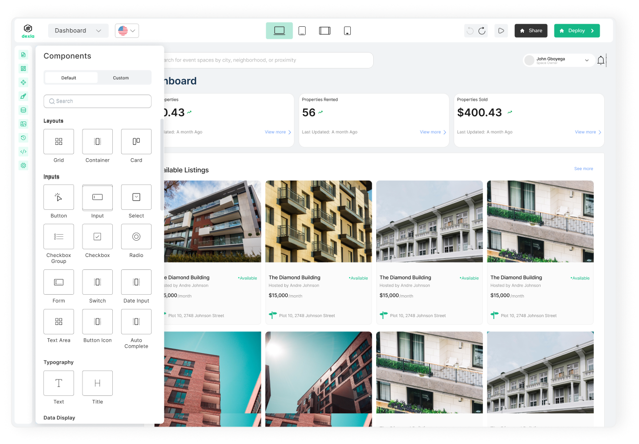
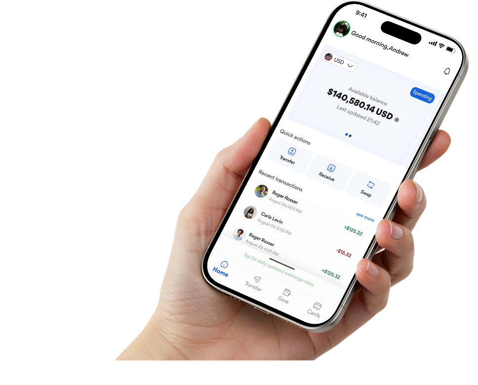
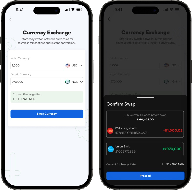
I saw an opportunity to simplify web app development by integrating direct canvas editing, AI-assisted onboarding, and a structured 96-column grid system, allowing users to build with precision while keeping the experience fluid and beginner-friendly.
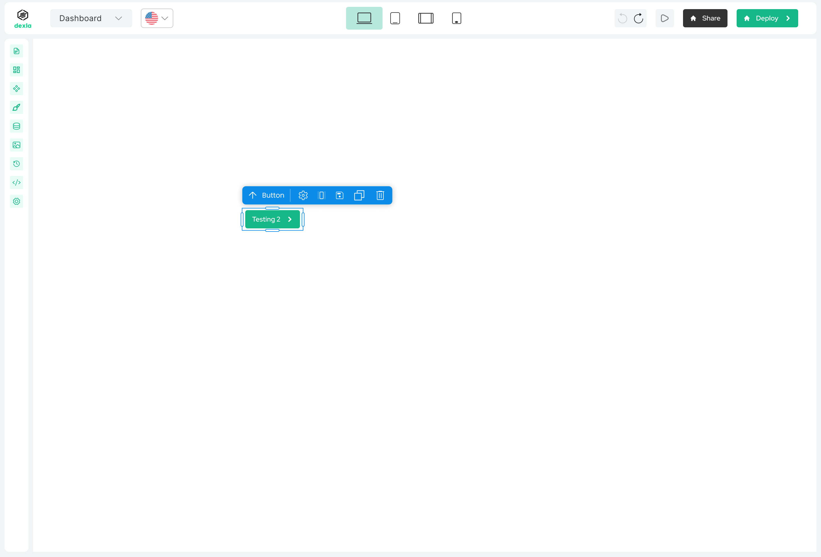
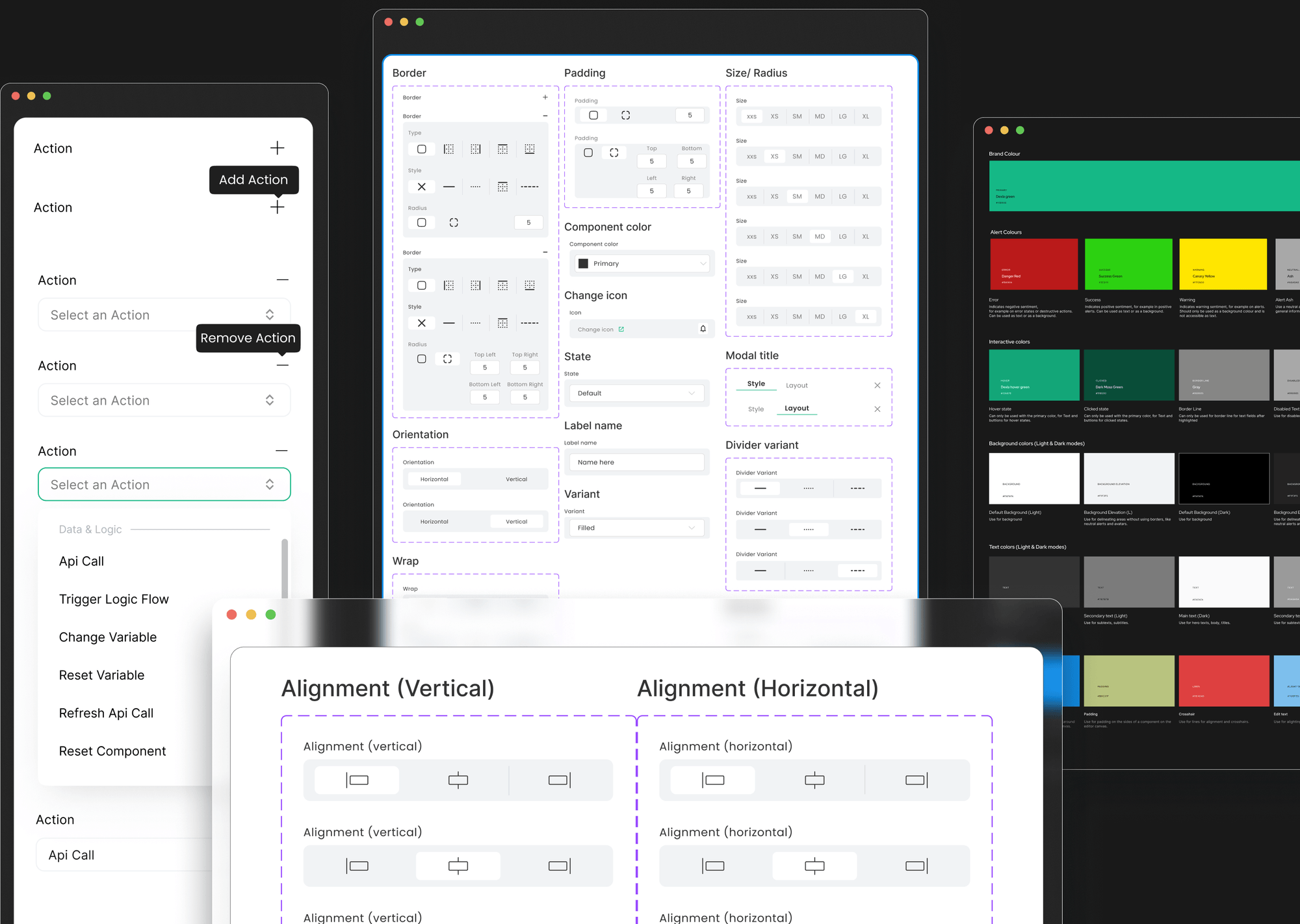
A major takeaway from platforms like Webwave and Jetadmin was the importance of alignment tools and spacing indicators. Inspired by their use of cross-hairs, rulers, and snap-to-grid mechanics, I designed Dexla’s drag-and-drop system to offer clear visual feedback, reducing frustration when positioning components. Unlike tools that required separate panels for fine-tuning, I ensured users could adjust layout, spacing, and resizing directly on the canvas—enhancing both speed and usability.
This research-driven approach led to a faster, more intuitive Dexla experience that empowers non-technical users to build apps effortlessly. By eliminating common pain points, complex terminology, rigid drag-and-drop mechanics, and hidden customisation settings, I crafted an interface that prioritises clarity, flexibility, and efficiency.
The result? A platform that helps entrepreneurs focus on their ideas rather than the technicalities of app building.

.png)
%20(1).png)

.png)
.png)


.png)


.png)
.png)
.png)

.png)

.png)


.png)